Transforming your home into a haven of calm begins with selecting the right serene home color palettes that soothe the soul and quiet the mind. Imagine stepping into a space where every hue whispers tranquility, inviting you to unwind and truly relax.
This curated guide delves into seven harmonious color schemes, from earthy neutrals to misty pastels, designed to inspire a deeply peaceful home decor. You’ll discover how specific color combinations, textures, and materials can elevate your living spaces into serene sanctuaries.
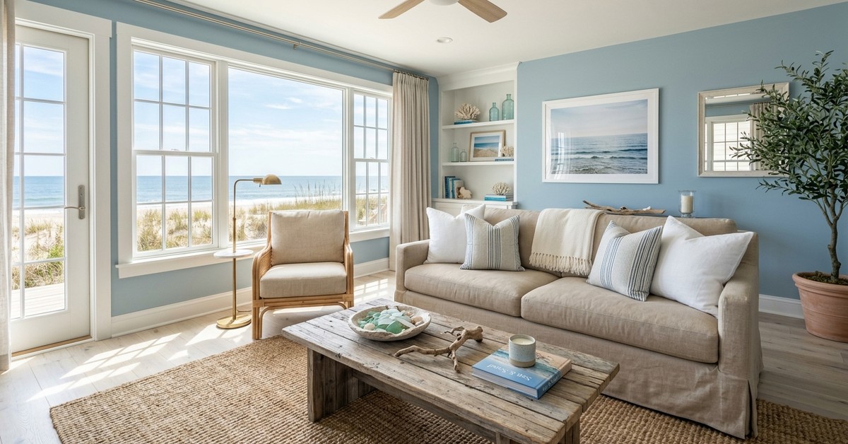
1. Coastal Whisper
Embrace the boundless calm of the ocean with a palette inspired by coastal serenity. Think soft, muted blues like Benjamin Moore’s “Palladian Blue” or Farrow & Ball’s “Light Blue,” paired with the natural warmth of sandy beige and crisp, sun-bleached whites.
Introduce textures through linen slipcovers, weathered driftwood accents, and woven jute rugs to evoke a breezy, airy ambiance. This calming interior design scheme feels effortlessly fresh, perfect for living areas or a tranquil bedroom retreat.
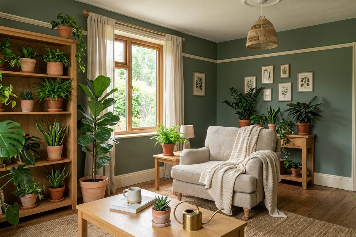
2. Verdant Sanctuary
Bring the grounding peace of nature indoors with a verdant sanctuary palette. Deep, muted greens such as sage, moss, and muted olive create a calming backdrop, beautifully complemented by creamy off-whites and natural wood tones.
Infuse this peaceful home decor with abundant houseplants, organic cotton throws, and unglazed terracotta pottery. This palette nurtures a sense of well-being, fostering a harmonious living space that feels like a quiet escape into the forest.
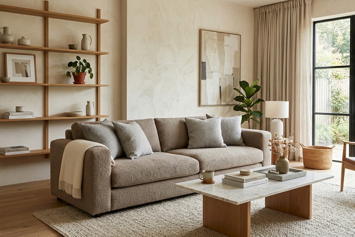
3. Warm Minimalism
For those who love simplicity with an inviting touch, warm minimalism offers a soothing solution. This palette focuses on rich, creamy off-whites like Sherwin-Williams “Alabaster” or “Swiss Coffee,” layered with warm taupes, soft greys, and natural oak finishes.
Materials like textured plaster, boucle fabrics, and subtly veined marble add depth without overwhelming the senses. It’s a sophisticated yet incredibly peaceful home decor choice, allowing space and light to be the true stars of your design.
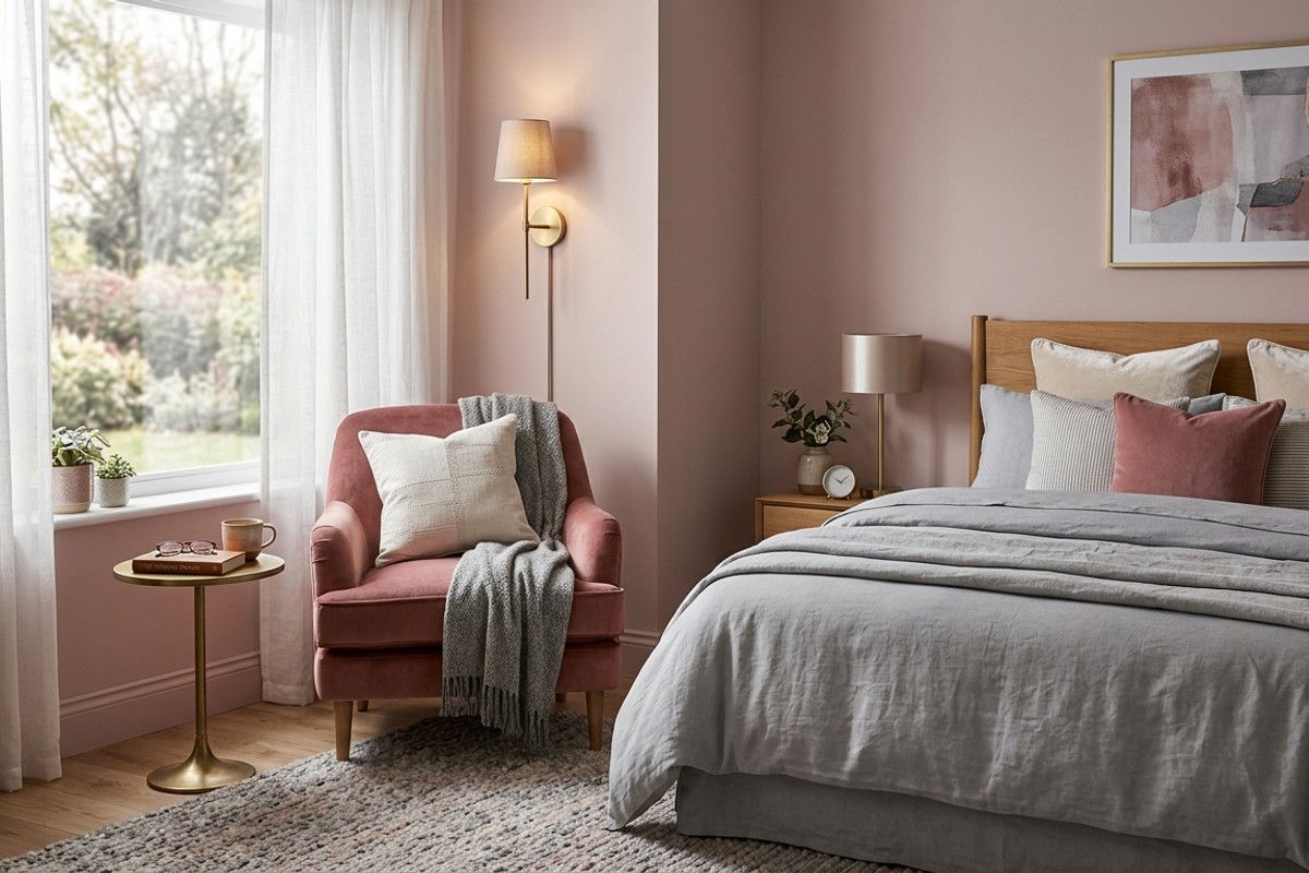
4. Dusky Rose & Ash
Infuse your home with a delicate, romantic serenity using a dusky rose and ash palette. Soft, muted pinks with grey undertones, like a desaturated blush or dusty lavender, are exquisitely balanced by cool ash grey and touches of warm cream.
This color scheme for relaxation works beautifully with plush velvet, brushed gold accents, and sheer window treatments. The gentle contrast creates an atmosphere that is both elegant and profoundly comforting, ideal for creating a luxurious yet calm bedroom or reading nook.
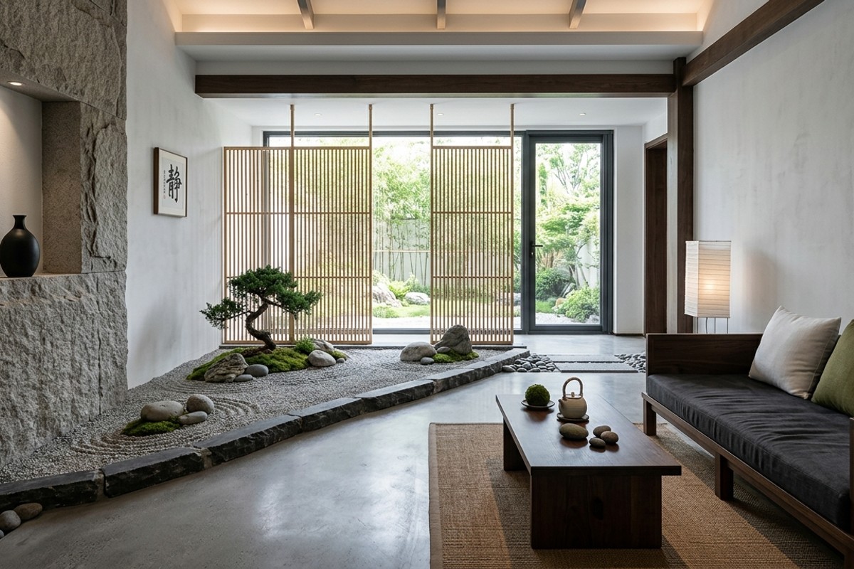
5. Zen Stone Garden
Drawing inspiration from tranquil Japanese gardens, the Zen stone garden palette offers ultimate serenity. It combines charcoal greys, cool whites, and soft, natural greens, punctuated by the earthy tones of unpolished stone and bamboo.

Introduce tactile elements like river rocks, smooth concrete finishes, and dark wood furniture to anchor the space. This zen interior colors approach emphasizes clean lines and natural textures, creating a contemplative, orderly, and deeply peaceful environment.
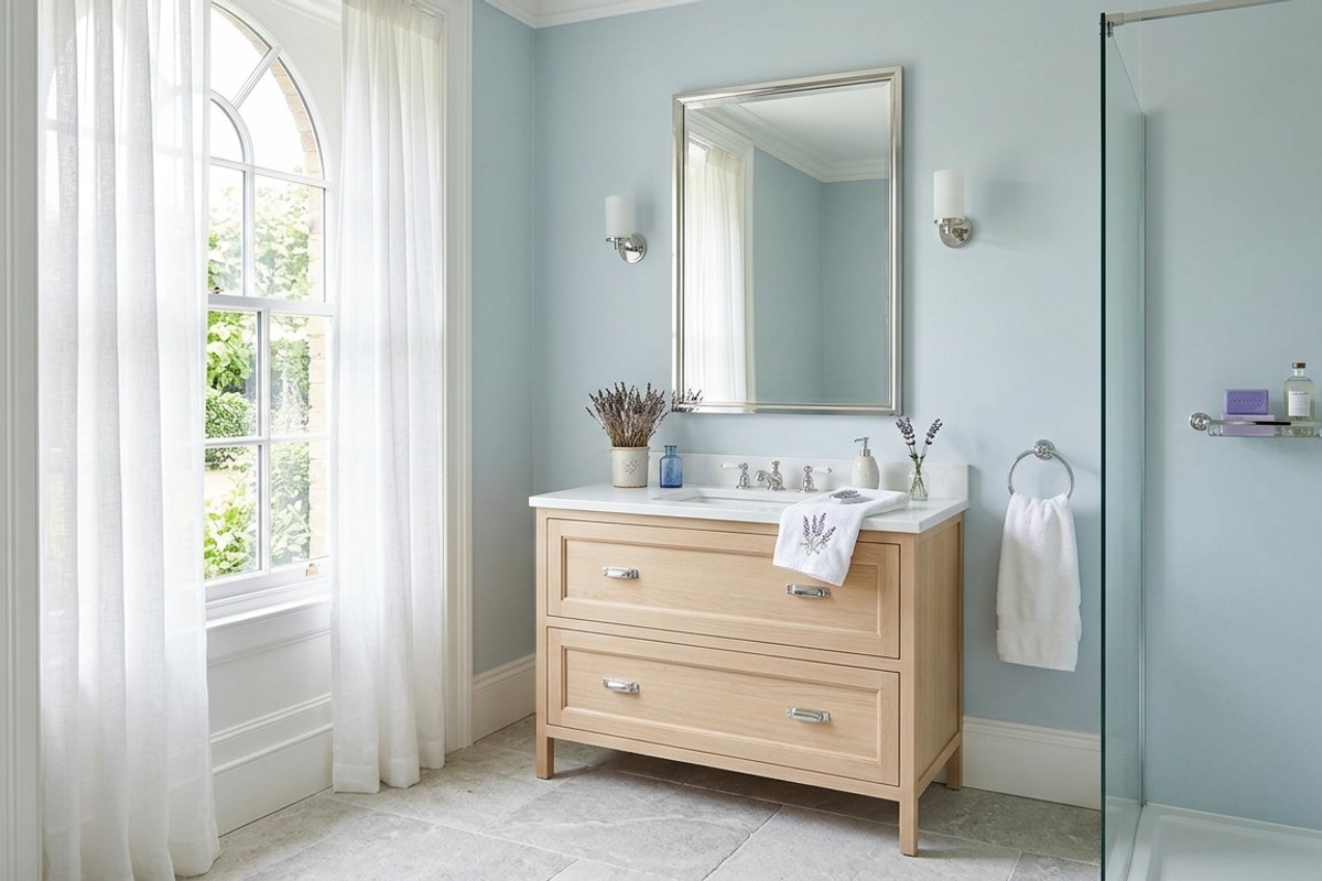
6. Soft Haze Blues
Immerse your rooms in the ethereal calm of soft haze blues. Think of a misty morning sky — pale, desaturated blues, whispers of lavender, and crisp white create an incredibly tranquil atmosphere. Consider colors like Farrow & Ball’s “Borrowed Light” or a muted periwinkle.
Pair these delicate hues with sheer fabrics, light blonde wood, and polished chrome or nickel accents to enhance the airy feel. This serene home color palette is perfect for a bathroom retreat or a bright, contemplative study, offering a constant sense of lightness and peace.
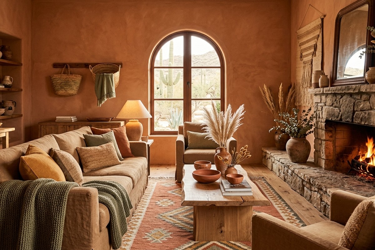
7. Desert Earth Tones
Find grounding and warmth in a desert earth tones palette, reminiscent of vast, sun-baked landscapes. This scheme features rich terracotta, sandy browns, warm ochre, and muted green-greys, anchored by the natural strength of raw wood and stone.
Incorporate woven textures, ceramic pottery, and dried botanicals to complete this calming interior design. It’s a cozy yet expansive feel, offering deep comfort and a strong connection to nature, making your home a peaceful oasis.
Final Thoughts
We hope these serene home color palettes have sparked your imagination, guiding you toward a more tranquil and beautiful living space. Which of these harmonious living spaces resonates most with your vision of calm?
Experiment with these color schemes for relaxation and observe how they transform the mood of your home. Your ideal haven of peace is just a brushstroke away!
Frequently Asked Questions
We hope you found your next Interior Design inspiration!
Thanks for visiting us!